
For the first time, researchers have used machine learning to identify exactly which health system changes would most effectively improve cancer survival in individual countries — and they've built a free online tool to show policymakers what those priorities are.
The work, published today in Annals of Oncology, analyzed cancer data from 185 countries alongside health indicators like wealth, insurance coverage, radiotherapy access, and healthcare staffing. What emerged wasn't a one-size-fits-all prescription, but a country-by-country roadmap showing which specific investments would likely have the biggest impact.
Why This Matters
Cancer kills roughly 10 million people annually worldwide, but survival rates vary dramatically depending on where you live. In wealthy nations, five-year survival for many cancers exceeds 70 percent. In some lower-income countries, it drops below 30 percent. The gap isn't random — it reflects real differences in health systems. But until now, there's been no systematic way to tell a specific country which single lever to pull first with limited resources.
We're a new kind of news feed.
Regular news is designed to drain you. We're a non-profit built to restore you. Every story we publish is scored for impact, progress, and hope.
Start Your News DetoxMilit Patel, a biochemist and data scientist at the University of Texas at Austin, led the modeling work. "Machine learning lets us generate predictions specific to each country," he explains. "We're turning complex data into actionable advice for policymakers." The team fed the model cancer incidence and death data from the Global Cancer Observatory, then layered in 15 health system variables — everything from the number of radiotherapy centers per capita to out-of-pocket healthcare costs.
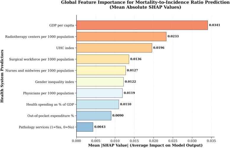
What the Data Reveals
The findings expose how different countries face different bottlenecks. In Brazil, universal health coverage emerged as the strongest predictor of better cancer outcomes. In Poland, radiotherapy availability and GDP per capita matter most. Japan, the USA, and the UK show a different pattern entirely — nearly all health system factors correlate with improved survival, suggesting these countries have already solved the basics and need broader optimization.
China's profile is more mixed, with GDP growth, universal coverage expansion, and radiotherapy access all playing significant roles. These aren't abstract correlations. They're signals telling policymakers: if you have $100 million to spend on cancer care, here's where it will likely save the most lives in your country.
The researchers used a transparency method called SHAP (Shapley Additive exPlanations) to explain how each factor influences predictions. Patel emphasizes an important caveat: red bars in the country-specific graphs don't mean those factors are unimportant. They simply show which factors currently explain the largest differences in outcomes. "A low score doesn't mean you should neglect an area," he says. "It means that, right now, that's not where your biggest disparities are coming from."
The Limits and What's Next
The model has real constraints. It works with national-level data, which can mask regional variation. Data quality differs between countries. And correlation isn't causation — the model shows which factors correlate with better outcomes, not proof that changing them will directly improve survival.
But within those bounds, the tool offers something policymakers have lacked: a data-driven way to prioritize. As cancer burden grows globally, especially in lower-income regions, that ability to focus resources on the highest-impact interventions becomes increasingly valuable. The researchers have made the tool publicly available, letting any country explore its own profile and see where evidence suggests the biggest gains lie.