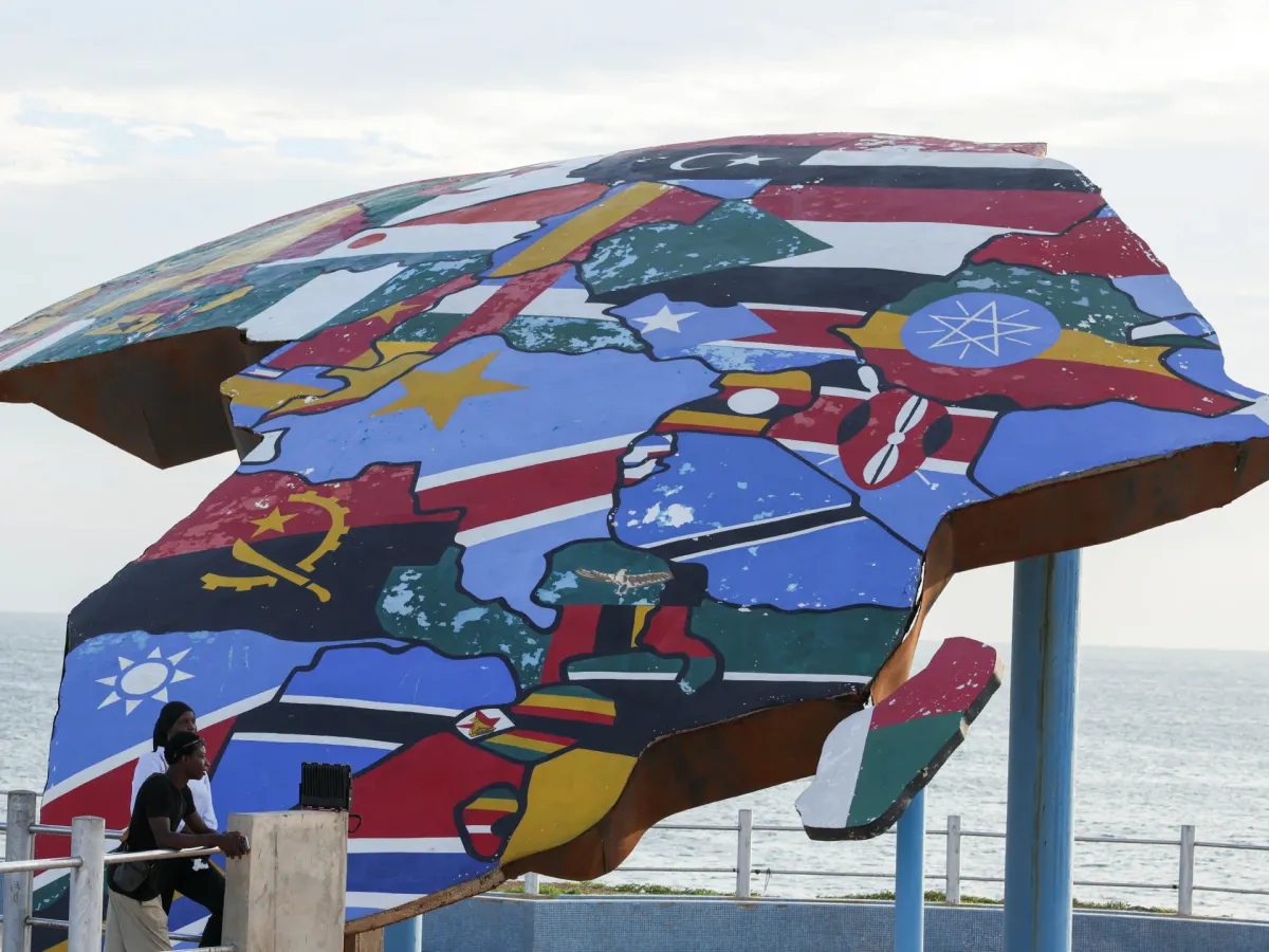

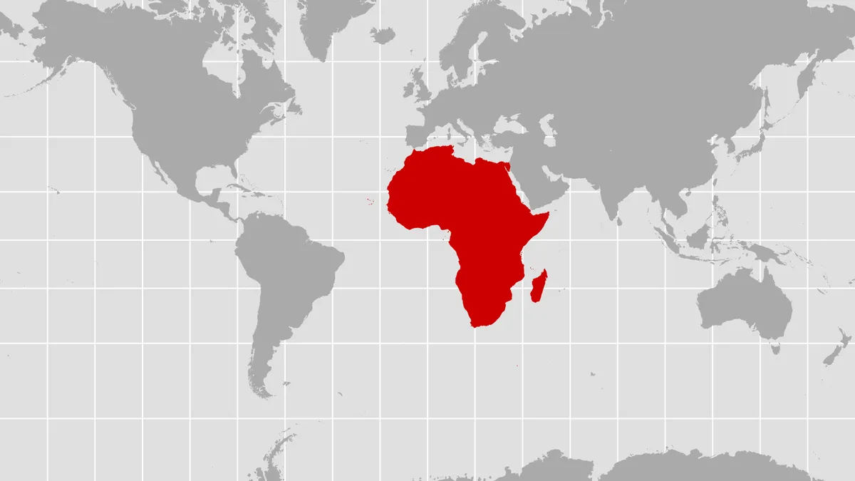
Turns out, the map hanging in your old classroom probably lied to you. Not maliciously, just... inaccurately. The United Nations General Assembly just passed a resolution, spearheaded by Togo on behalf of the African Group, to finally show Africa and other continents in their actual relative sizes. Because apparently, that's where we are now: correcting basic geography at a global level.
The "Correct the Map" resolution sailed through with 164 votes in favor, six abstentions, and one lone dissenter: the United States. Yes, really. The U.S. was the only country to vote no on a resolution about map accuracy. More on that delightful tidbit in a moment.
Why Your Old Map Was Lying
For centuries, most of us have grown up with the Mercator projection. Created in 1569 by Gerardus Mercator, it was a navigational marvel for sailors plotting straight courses. The problem? It keeps the shapes of landmasses correct but wildly distorts their size. Regions closer to the poles — like North America and Europe — look significantly larger than they are, while places near the equator, especially Africa, appear much smaller.
We're a new kind of news feed.
Regular news is designed to drain you. We're a non-profit built to restore you. Every story we publish is scored for impact, progress, and hope.
Start Your News DetoxImagine a world where Greenland looks roughly the size of Africa. On a Mercator map, it does! In reality, Africa is about 14 times larger. Let that sink in. Tom Patterson, a former cartographer for the U.S. National Park Service, told NPR that students using a Mercator map get a "completely warped view of the size of countries."
Enter the Equal Earth projection, which Patterson co-created in 2018. It's an "equal-area" map that prioritizes showing true relative sizes, even if it means a little shape distortion. Think of it as geographic justice.
This new UN resolution isn't legally binding. It won't force anyone to ditch their beloved Mercator. But it does strongly encourage governments, international organizations, and especially schools to start using equal-area maps. The goal is to challenge old perceptions and ensure the world map "finally reflects Africa's true scale, weight, and place in the world," as the African Union put it.
The Geopolitical Map Debate
So, why the U.S. opposition? Yaryna Ferencevych, deputy U.S. representative to the U.N. Economic and Social Council, called the resolution an "ideological agenda" that distracts from more pressing issues, dismissing such resolutions as "barnacles on our work." Because nothing says "serious global issues" like debating map projections, right?
Meanwhile, the cartographer who helped create the Equal Earth map, Tom Patterson, was genuinely surprised. He posted on social media, "Wow. When we created the Equal Earth projection in 2018, we never imagined this." It seems that for 164 countries, showing the world as it actually is — rather than as a 16th-century sailor needed it to be — is a pretty good idea. Who knew a map could cause such a stir? Now go find an accurate one and prepare to have your mind slightly blown by the true scale of things.