
The Trump administration closed many climate programs and public information sources. However, much of this information has been saved. Non-profit groups also continue to provide user-friendly data.
Here are some of the best places to find climate dashboards, maps, and analysis.
Where to Find Rescued Climate Data
Climate.us
One key government site that was shut down was climate.gov. This NASA-run site offered climate information for everyone, not just experts. Luckily, some people created a new site to replace it.
This new site keeps the original climate dashboards, maps, blogs, and articles. Its goal is to be a lasting, independent, and scientific platform for climate communication and education.
We're a new kind of news feed.
Regular news is designed to drain you. We're a non-profit built to restore you. Every story we publish is scored for impact, progress, and hope.
Start Your News DetoxKate Yoder at Grist wrote about this project, calling it "The plan to make climate science harder to erase." Jenae Barnes in The 19th also highlighted the women who rebuilt the site after Trump dismantled it.
Anika Jane Beamer from Inside Climate News shared another story about rescuing government information. Her piece, "‘Canary in a Coal Mine’: Data Scientists Restore a Climate Justice Tool Taken Down by Trump," focuses on the Climate and Economic Justice Screening Tool.
Beamer's article also links to the Public Environmental Data Partners. This group lists several recovery projects, including a new version of the screening tool.
For a full list of climate projects ended by the Trump administration, visit the Sabin Center for Climate Change Law at Columbia Law School. They offer three main tracking tools. These include the Climate Backtracker, the Inflation Reduction Act Tracker, and the Silencing Science Tracker.
The Sabin Center also provides a global litigation database, an attribution database, and other resources.
Climate Central
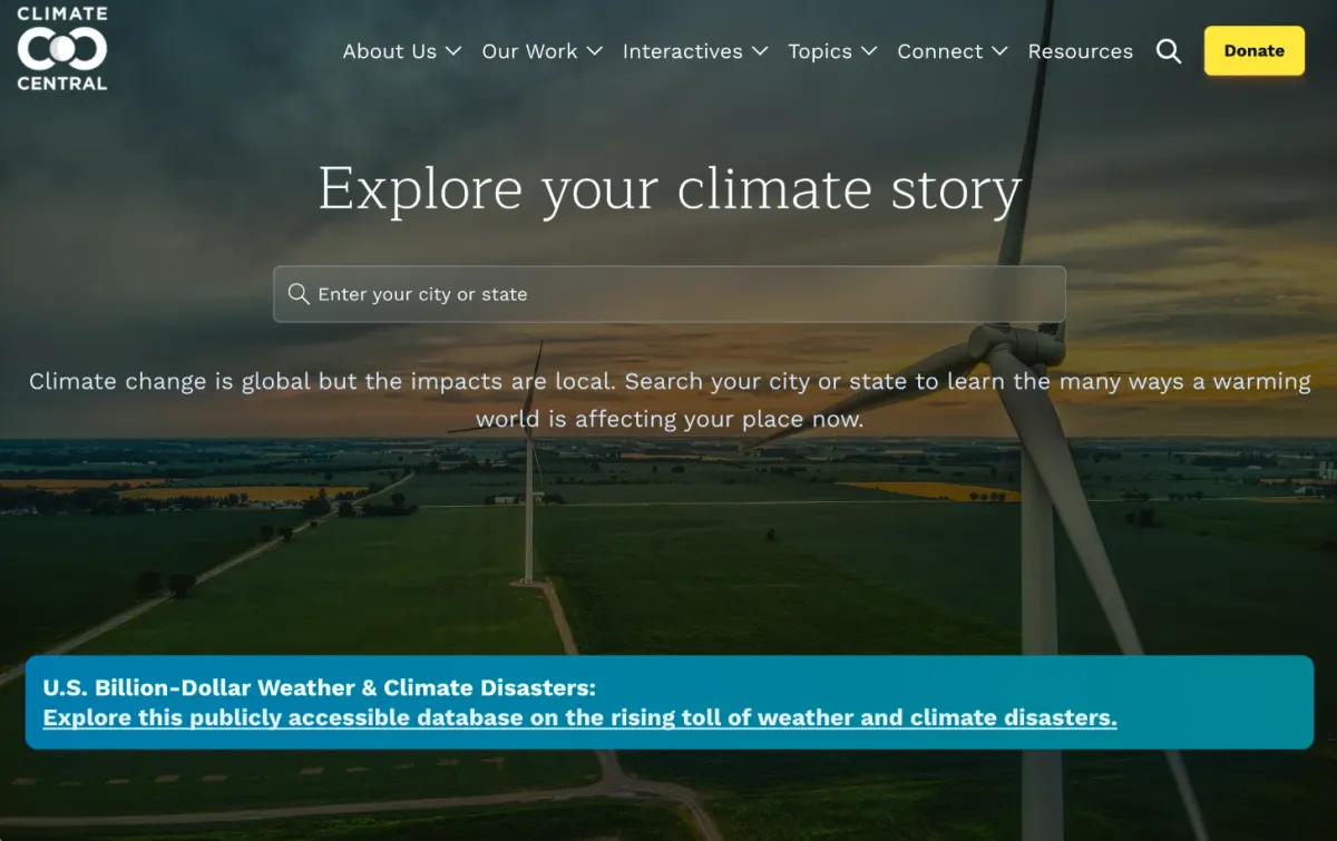 Screenshot via Climate Central
Climate Central is a major source of easy-to-understand climate data. It is a non-profit group of scientists and communicators. They research and report facts about climate change and its effects.
You can use their Climate Shift Index to see how the climate has changed in your city. For a visual representation, check out the Warming Stripes database. This shows climate information using colored stripes.
Climate Central also has resources on sea level rise, fire weather days, and billion-dollar weather disasters. Sophie Hurwitz from Grist reported that Climate Central saved a crucial disaster database that Trump had ended.
Reuters Climate Monitor
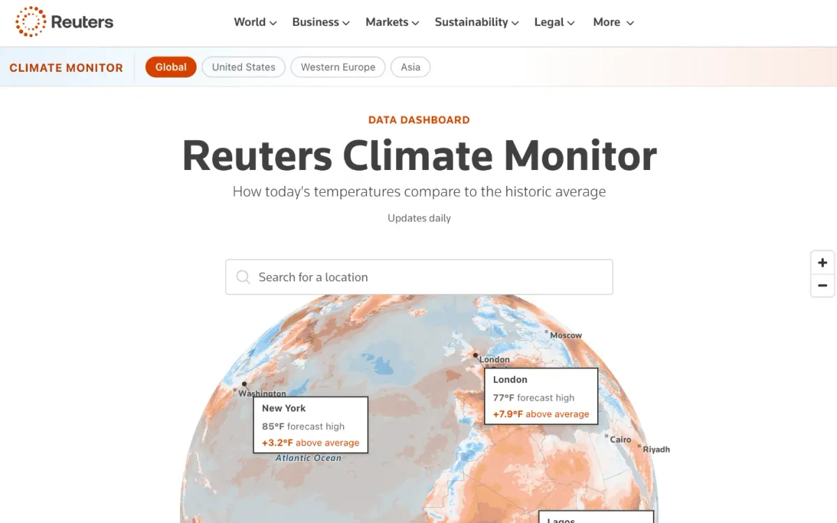 Screenshot via Reuters
The Reuters Climate Monitor compares today's temperatures to historical averages. It covers specific places, continents, and the entire globe. The data is shown in numbers, graphs, and a searchable map with temperature colors.
This monitor updates daily. It covers many locations, including cities, national parks, small towns, and even roads.
Our World In Data: Climate Change
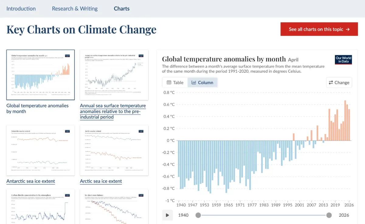 Screenshot via Our World in Data
This non-profit organization offers extensive climate data. It presents technical information in clear graphics.
Its pages cover climate change, CO2 and greenhouse gases, energy, wildfires, air pollution, and natural disasters. It also looks at the environmental impacts of food.
Mapping The Unmapped
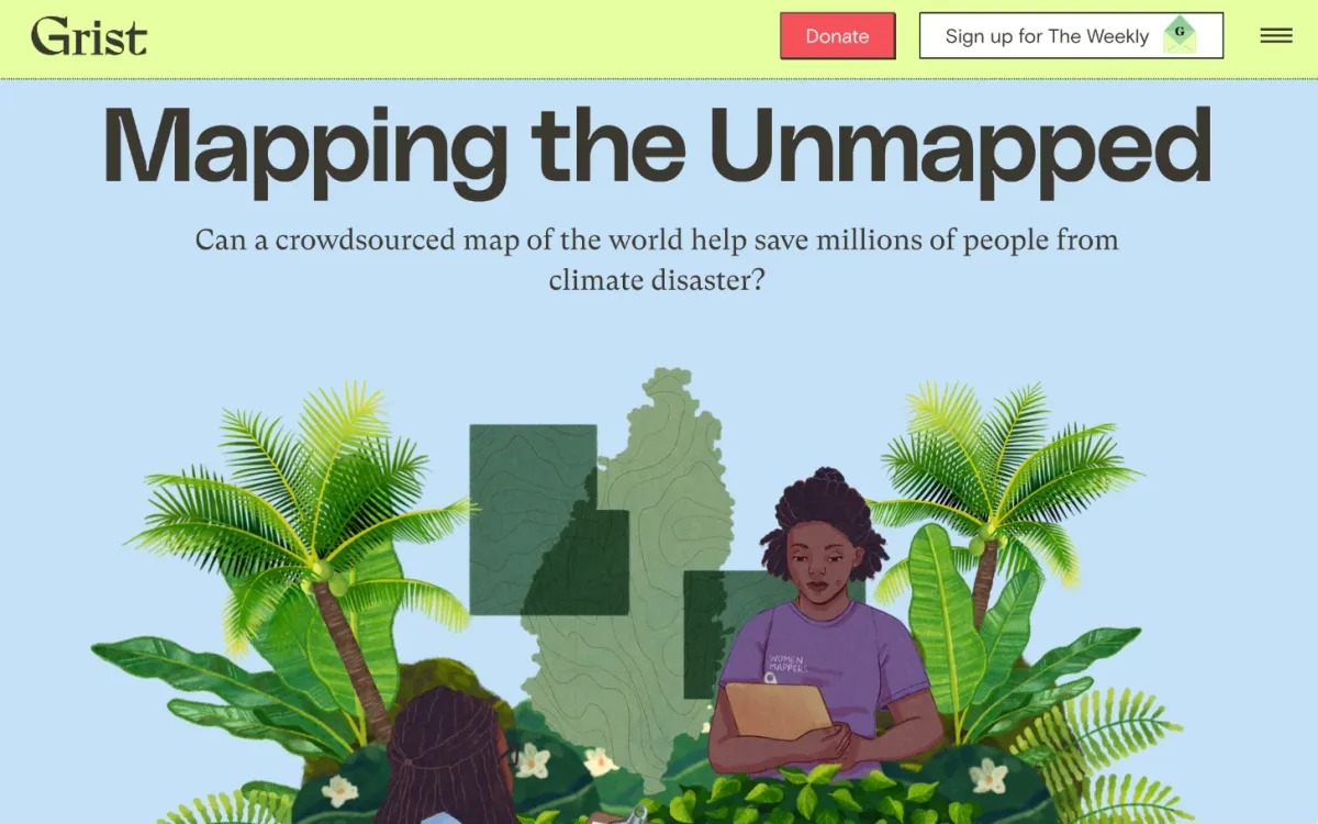 Screenshot via Grist
This Grist article by Maddy Crowell tells the story of creating a unique data source. It focuses on mapping remote, poor, or sparsely populated areas. These places are often missed by services like Google Earth. However, they desperately need disaster relief.
Volunteers coordinate this mapping effort through the Humanitarian OpenStreetMap Team. Their platform is OpenStreetMap.
Project Cosmos
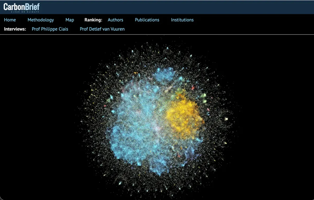 Screenshot via Carbon Brief
Carbon Brief recently launched Project Cosmos. This large database is mainly for academics. However, its visualization is interesting even for non-researchers.
It shows climate research as an interactive "cosmos" or network graph. Each publication is a "star." This reveals how different climate research fields connect and build on each other.
The graph looks like an exploding universe with many colors. The colors, sizes, and spacing show the authors' academic fields. They also represent how often a publication is cited or the network of specialists who read each other's work.
This database includes over 1.8 million publications linked by citations. It is the most complete map of human knowledge on climate change ever created. It tracks more than a century of academic research. The homepage explains how different types of studies, like medicine, psychology, biology, and physics, are shown in this network graph.