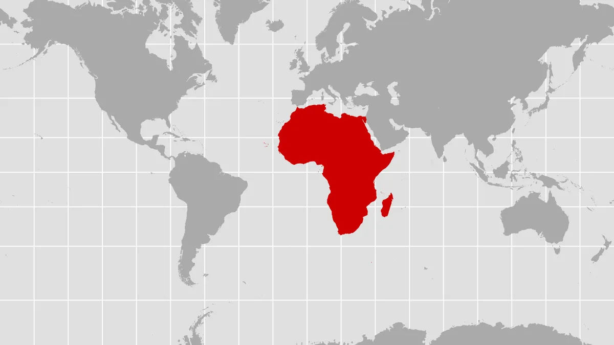

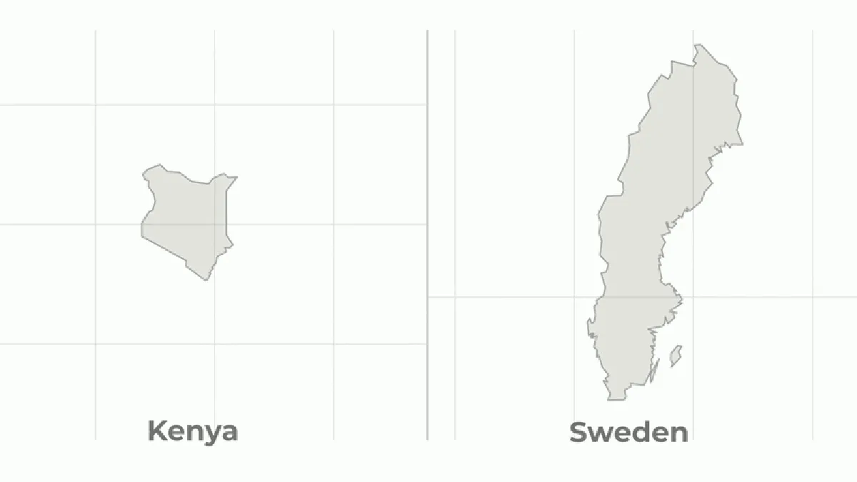
For centuries, your classroom map has been lying to you. Not maliciously, mind you, but effectively telling you that Africa is roughly the same size as Greenland. Which, if you've ever glanced at a globe, you know is wildly, hilariously wrong. Africa is, in reality, about 14 times larger than Greenland.
This cartographic conspiracy is thanks to the Mercator projection, a 16th-century invention perfect for European sailors navigating by compass. Its fatal flaw? The farther a landmass is from the equator, the more it inflates. So, Europe (including Russia) and North America got a serious ego boost, while Africa, Latin America, and South Asia got the short end of the stick. Literally.
A New Map for a More Honest World
Finally, the United Nations General Assembly (UNGA) decided enough was enough. In a landslide 164-to-one vote, they adopted a resolution promoting the Equal Earth projection. This map, as its name suggests, actually shows continents in their actual proportions. Imagine that.
We're a new kind of news feed.
Regular news is designed to drain you. We're a non-profit built to restore you. Every story we publish is scored for impact, progress, and hope.
Start Your News DetoxThis whole effort was spearheaded by Togo, on behalf of the African Group and with the blessing of the African Union. Their goal? To correct the visual shrinking of Africa and other equatorial regions. The resolution gently nudges schools, institutions, and tech giants to make the switch. Because apparently, maps influence more than just navigation — they shape our entire worldview, according to Togo’s Foreign Minister Robert Dussey.
Now, who was the single holdout, the lone dissenter in this global cartographic correction? The United States. Their representative, Yaryna Ferencevych, called the measure a "radical ideological project" and suggested the UN should focus on "genuine problems" instead of "map projects from the 16th century." Because, you know, maps that accurately depict the world's landmasses are apparently not a genuine problem.
It's important to note: this isn't a ban on Mercator. It's an encouragement. A polite suggestion to stop making half the world look like an afterthought. The African Union already made the switch in March, and Togo is even planning a meeting with UNESCO, the AU, and tech companies like Google to figure out how to put this new, more truthful map into widespread practice.
Because while all flat maps distort something (you can't unpeel an orange and lay it flat without tearing it), Mercator chose to prioritize accurate angles for sailing. Equal Earth, on the other hand, prioritizes accurate land area. Which means, yes, the outlines are a little bent. But at least Russia isn't secretly the size of Jupiter anymore. Let that satisfying number sink in.