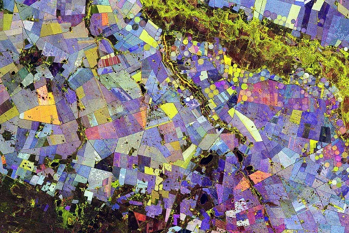

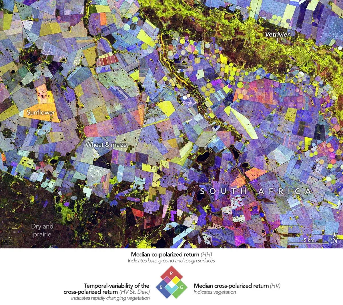
Imagine peering at a canvas, all swirls of red, green, and blue, thinking it's some abstract masterpiece. Now imagine that painting is actually a satellite's incredibly detailed report card on South Africa's farmlands.
That's what the NISAR satellite has delivered from the 'Maize Triangle,' a sprawling agricultural heartland in the Free State province. It's not just pretty to look at; it's a deep dive into what's growing, how fast, and when it’s harvested — all without a single farmer having to file a report.
The Art of Crop Tracking
Between November 2025 and March 2026, the NASA-ISRO Synthetic Aperture Radar (NISAR) satellite swooped over the region 10 times. Unlike traditional satellites that just see color, NISAR uses L-band radar. Think of it as X-ray vision for plants, allowing it to see the actual structure of crops, not just their surface hue.
We're a new kind of news feed.
Regular news is designed to drain you. We're a non-profit built to restore you. Every story we publish is scored for impact, progress, and hope.
Start Your News DetoxBy layering these radar observations, scientists like Paul Siqueira from the University of Massachusetts Amherst could create a dynamic map. He points out that maize and sunflowers have distinctly different 'signatures' from, say, a patch of forest, due to their size and how they grow.
In this technicolor farm report:
- Green means a thriving, vegetated area.
- Red indicates an unvegetated surface, likely a harvested field.
- Blue reveals how rapidly a vegetated area changed over the season. Stable plants, like trees, show up as a lighter blue. Quick-change artists, like wheat or corn, appear darker blue.
And when green fields are harvested early, turning red? That vibrant mix creates an orange hue, a common sight for sunflowers in the region. It's like a time-lapse film, but with radar.
This isn't just a clever parlor trick. By seeing how radar waves bounce back (cross-polarized or co-polarized, for those keeping score), scientists can track everything from crop development to irrigation efficiency and land use changes. It’s a consistent, wide-ranging view that helps us understand how farming systems are coping with water availability and the ever-shifting climate.
Which, if you think about it, is both impressive and slightly terrifying for anyone who prefers their agricultural secrets to remain, well, secret. The satellite sees all.