
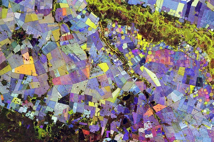
Imagine staring at a modern art piece, all swirls and bold blocks of color—only this isn't in a gallery. It's a satellite image of South African farmlands, looking suspiciously like a Mondrian painting if Mondrian had a thing for cornfields. This isn't just pretty to look at; it's NASA's new party trick for tracking crops.
Down in the Free State province, along the appropriately named Vetrivier (Vet River), fields spread out across what's usually a dry patch of earth. This region is part of the "Maize Triangle," a fancy name for the area that churns out most of South Africa's maize (that's corn, for the uninitiated). And from space, it looks absolutely wild.
Colorful circles mingle with straight lines in shades of red, green, and blue. Each hue tells a story about what’s growing, or not growing, and how it's all changing during the Southern Hemisphere's growing season.
We're a new kind of news feed.
Regular news is designed to drain you. We're a non-profit built to restore you. Every story we publish is scored for impact, progress, and hope.
Start Your News DetoxThe Radar That Sees Beyond Color
The magic behind this abstract farm art comes from the NISAR (NASA-ISRO Synthetic Aperture Radar) satellite. Between November 2025 and March 2026, NISAR made 10 passes over the area, essentially giving these fields a very thorough once-over. But unlike your average camera, NISAR uses L-band radar. This means it doesn't just see the color of plants; it sees their structure.
Think of it as an X-ray for plants. It measures how the radar signals bounce back, giving scientists data on how each tiny pixel of the landscape is changing. NISAR science team lead Paul Siqueira noted that while the picture is undeniably beautiful, it's also packed with vital intel. It shows how crops like maize and sunflowers behave differently from, say, a stable forest, based on their size and growth cycles.
So what do the colors mean?
Green means there's something growing. Red means the surface is bare. And blue? That's the real standout, indicating how quickly the vegetation changed over the season. Stable plants, like trees, show up as a light blue. But crops that are constantly shifting their structure — like wheat or maize — lean towards a darker blue.
Most fields are a delightful mix, creating that vibrant, varied palette. For instance, plants that sprout fast (green) and get harvested early (red) often create an orange tint. Sunflowers, apparently, are big fans of this particular color combo. Though, a ground crew would have to confirm if it's actually sunflowers or just some very enthusiastic weeds.
This isn't just a pretty picture for NASA's fridge. By combining all these radar measurements, scientists get a consistent, detailed map of the landscape's features throughout the growing season. This means they can track crop growth, see the effects of irrigation, and spot changes in land use across vast areas. As NISAR keeps collecting data, researchers will be able to compare seasons, pinpoint growth differences, and better understand how our food systems are responding to water and climate shifts. Which, if you think about it, is both impressive and slightly terrifying.